Thursday, 8 April 2010

Title/Logo

How i made the title:

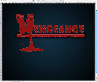
Kirsty created the title in Photoshop. She used a downloaded font called broken74 because she thought it reflected the approaching horror of the film.
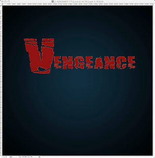
The line underneath the text was part of a downloaded title. Kirsty changed the colour to a dark red that looked like blood. She then added a black outer glow around it to make it stand out and look creepier. She included the line because she felt it gave a sense of finality and strength to the title, increasing the tension of the film.
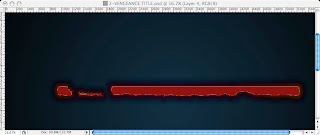

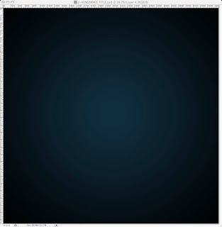
She added a dark blue background then put a white radial gradient, at 61% opacity into the middle of it, that created a faint white circle behind the title, i.e. it lighted up the background behind the text. This again made it stand out more and also gave it a dark and sinister look.


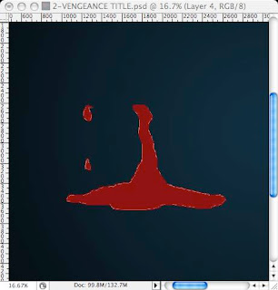
She drew a shape that resembled blood dripping into a puddle, and then placed it underneath the letter V so that it looked like the blood was pouring off of the letter. She then made two little droplet shapes so that it looked like blood was dripping off of the other side of the V as well which made it seem a bit more realistic. This made it scarier and gave an insight into what might happen later in the film.

Then she brought the letter V in front of the line so that the blood effect would work properly and so that it stood out more. I then added a bevel and emboss to the text, line and dripping blood shape to make it stand out more and create a terrifying effect.
Below is a picture of the finished title:


Once we added the title to our product we made the title sharpen when the music that we added over the top of it reached its peak to add to the effect.


How we made our company logo:
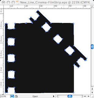
Kirsty used this part of the new line cinema logo design and got rid of everything else in the image in Illustrator, so Kirsty ended up with this:


Kirsty then transferred this image to Photoshop.
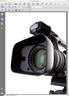
Kirsty found the picture below on the internet then flipped it horizontally so that it faced the right and resized it to suit the image of the filmstrip. She then deleted the white background so that the camera was all that was left.


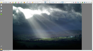
Kirsty wanted a dramatic sky effect in the background to add an eerie mood to the logo. This also reflects the type of films our company would make – horror films. She used a layer mask in Photoshop by dragging the cursor from bottom to the top of the page. It starts out white so that the ground disappears and gradually starts to go transparent at around half way up the page. So it still allows the sky to be seen but not the ground (which is what she wanted).


She created the filmstrip manually on Photoshop by making a black rectangle then putting smaller rectangles in the middle of the big one, but changing the colour to white. Then she made smaller squares to put above and below the white rectangles and made these white as well. She changed the opacity of the small squares and smaller rectangles to 5% so that rather than being completely transparent it gives the appearance of a real filmstrip.


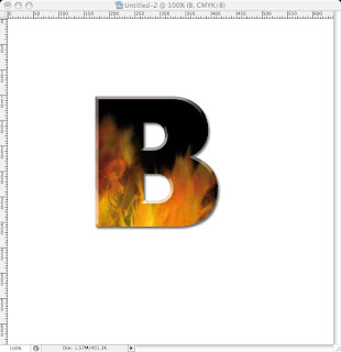
Kirsty then added the text – a single letter, in capitals and herald font so that it is bold and stands out, to each small rectangle. She changed the colour of the text to a wood background, then added a pattern overlay filter, under bevel and emboss, of a fire effect.

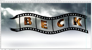
She put a white background as a mask over the top of the sky but behind each letter to make them stand out. She then applied a wave filter by clicking on filter then picking distort from the drop down menu then clicking on wave on the second drop down menu.
So by doing all of this she created this film strip:


Kirsty then used the smudge tool on the end of the film strip by clicking on the black film strip and dragging it into the camera lens. She did this in order to give the effect of the filmstrip emerging from the camera.

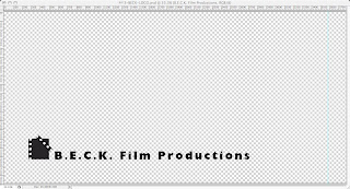
She added the text shown below in herald font so that it stood out and put it at the bottom next to the new line cinema logo underneath the camera and filmstrip.


Below is an image of the finished logo:


Once we put this into IMovieHD we added a dark fog to make it look animated and also to make it scarier.

No comments:

Post a Comment

Newer Post Older Post Home